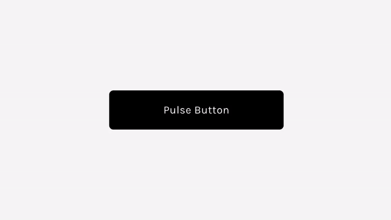
Pulse Button - Button Block
Plugin Details
Add a pulsing animation to the button block – primary, secondary, and tertiary.
Compatibility
Works with Squarespace 7.1
Uses Custom CSS
Option 1: Add to Custom CSS (Animation On Loop)
// PULSE - BUTTON BLOCK - GHOSTPLUGINS.COM //

.sqs-block-button .sqs-button-element--primary,
.sqs-block-button .sqs-button-element--secondary,
.sqs-block-button .sqs-button-element--tertiary {
  animation: pulse 1s infinite alternate; // animation duration and speed
}

// PULSING ANIMATION - ADJUST THE SCALE OPTION TO CHANGE PULSING SIZE

@keyframes pulse {
  0% {
    transform: scale(1);
  }
  50% {
    transform: scale(1);
  }
  100% {
    transform: scale(1.2); // button size during pulse animation
  }
}
Option 2: Add to Custom CSS (Animation On Hover)
// PULSE - BUTTON BLOCK - GHOSTPLUGINS.COM //

.sqs-block-button .sqs-button-element--primary:hover,
.sqs-block-button .sqs-button-element--secondary:hover,
.sqs-block-button .sqs-button-element--tertiary:hover {
  animation: pulse 1s infinite alternate; // animation duration and speed
}

// PULSING ANIMATION - ADJUST THE SCALE OPTION TO CHANGE PULSING SIZE

@keyframes pulse {
  0% {
    transform: scale(1);
  }
  50% {
    transform: scale(1);
  }
  100% {
    transform: scale(1.2); // button size during pulse animation
  }
}
Customizable Options
Animation Speed
Pulse Size
Notes
Only add one of the code options.
Plugin is applying to all button block types (primary, secondary, tertiary). You can remove the ones you don’t want to target.